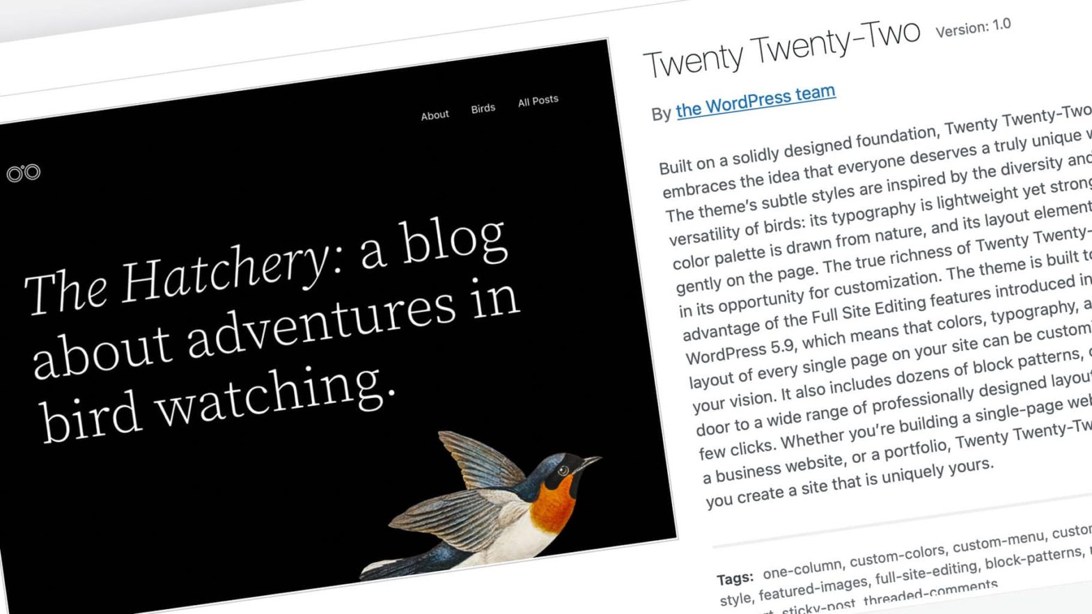
Today – after the dev team agreed on the delayed release of the next major release of WordPress core – is the launch of the first supported release of full-site editing (FSE) for the platform. I don’t even know what to say to a volunteer team of passionate open-source developers that create a CMS that powers 40% of the entire internet with one of the most formidable releases in its history during a pandemic. This is the first full release cycle of software I’ve followed outside of products I helped test internally, and it’s going to massively reform how personal and professional websites are built.
Throughout the week, I’ll be continually updating this post with my own first experiences with the product alongside WPTavern’s, Torque’s and Gutenberg Times coverage. If you’re in the mood to follow along, check out the list below.
- Gutenberg Times: What’s New in WordPress 5.9
- Gutenberg Times: How WordPress 5.9 Creates a Foundation for the Future
- WPTavern: Revise Release Date Confirmed for 1/25
- WPTavern: WordPress 5.9 “Josephine” released
- TechRadar: Major WordPress update will make amateurs look like master web developers
I’ve had a chance to install and upgrade to WordPress 5.9, and I’m impressed with the ambition of this project. It’s noticeably in the infancy of what full-site editing will eventually be, but there’s a world of potential. We’re almost at a tipping point where both customized design and software development are finally accessible to the same audience. While this is an impressive first swing, it fell short of what “full site editing” means to a layperson. More noticeable? The limitations of the initial release of the Twenty Twenty Two theme.
The Good
We have to start with design. The ease of a two-click experience that allows a site administrator to change the global colors, backgrounds and typefaces is a huge win. I love the customizer. I hate to see it go. But the potential here to make immediate shifts is huge. Losing the fonts API in this release was a real miss (though probably unavoidable), because you’re limited to common system fonts. Once the webfont API allows you to insert the Google font library, we’re going to see a renaissance in beautiful theme/site design.
That’s not the highlight though: The clearest improvement so far is the user experience when designing headers and menus. The menu screen up until this release was effective but clunky, and being able to fully customize a navigation experience in mobile is a long time coming. Hamburger menus, desktop layouts, dropping in logos are going to make a big difference for businesses without a real developer on staff.
Overall, the ability to customize themes for your homepage, single pages, blog posts, 404 pages, and search results is going to cut down on both cost and timing. But there are some annoying hiccups that prevented me from fully shifting to FSE.
The Bad
At the end of the day, this is one of the biggest shifts in publishing for the overwhelming majority of websites on the internet in years. In that vein, I would have liked to see more basic functionality out of the box. The Twenty Twenty Two theme in particular is a design marvel but a glaring miss on customization. If you can’t change the main typeface – in a system built to unlock customization – to anything beyond the default system font or Source Serif Pro without a third-party plugin, you don’t want to hype this up as a feature.
The Ugly
There’s no getting around it: The limitation on creating additional templates within the Editor is a miss in Twenty Twenty Two. Suppose you want to create multiple templates for the feature page (Here’s an example). The theme limits you to edit one or two single-page templates without a real mechanism for building multiple versions. You can build a fresh template in the ‘Create New page’ flow, but this feels clunky and a newer user would be lost. This nerfs the ability for online magazines to build different features for smaller editorial issues and campaigns. I was only able to add one additional template from the Editor: a homepage. If this isn’t a top priority in WP 6.0, it should be.
Overall
Considering the market penetration of WordPress, this is a significant moment for the open internet that won’t get a significant amount of press outside of the trades. However, you’re going to notice small businesses and new entrepreneurs outside of American cities finally level up on site design and accessiblity now that better tools and patterns are available to them out of the box. It’s a significant (but far from perfect) first step toward “low code” customized site development. I’m anticipating serious improvement when 6.0 is released, but it’s a good first swing that showcases the power of Gutenberg.
WordPress 5.9 Youtube teaser:
Congratulations to everyone involved. What a big moment for the open internet.
